Every morning the same ritual: three Excel files in the inbox, two WhatsApp screenshots from the night shift, and a production board that was last updated yesterday afternoon. By the time someone merges the numbers, the shift is already half over — and the decision you needed at 07:00 arrives at 10:40.
In 24 years around production planning, process engineering and shop-floor control, I keep meeting the same pain: managers are not short of data; they are short of one live picture they can trust. This note is a practical starter for moving from spreadsheet chaos to a single operations dashboard — with a worked example (illustrative numbers, not a client case), a small KPI set, and a checklist you can run this week.
Why Excel keeps winning — and why it loses on the floor
Spreadsheets are wonderful for analysis. They are a poor nervous system for a running plant. Typical failure modes I see again and again:
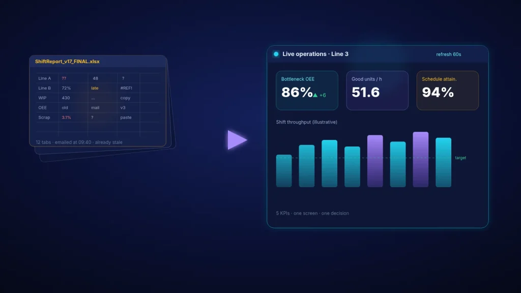
- Stale by design: a file emailed at 09:40 already describes a shift that started at 06:00.
- Many versions of the truth: ShiftReport_v17_FINAL.xlsx sits next to FINAL2 and a printed board with different scrap numbers.
- No owner for “what is red”: colour means decoration, not an agreed action threshold.
- Wrong audience on one screen: the plant manager’s monthly chart is forced onto the operator who only needs five live numbers.
Recent manufacturing dashboard practice is clear on this: build for the role, keep a small KPI set, and refresh on a human decision cycle — often about 30–60 seconds for shop-floor glance, not every tick of the PLC, and not once a day in email. Role-specific views (operator vs supervisor vs manager) matter more than packing every available field onto one slide.
If you do not yet know which station sets the pace, fix that first. My earlier notes on finding the production bottleneck with data and on why OEE gains may not reach EBITDA explain why the dashboard must point at the constraint, not at the prettiest average.
A simple dashboard architecture (three layers)
- Operator screen (glance, 3–5 KPIs): bottleneck status, good units vs plan this hour, scrap after the bottleneck, current reason code, time since last update. Readable from a few metres. Green / amber / red with agreed thresholds.
- Supervisor screen (shift control): same KPIs by hour, downtime Pareto, WIP in front of the constraint, schedule attainment so far.
- Manager screen (exceptions + money): trend vs plan, contribution at risk, only the lines that are off target. No need to scroll through every station every morning.
Worked example (illustrative): Line 3 packing cell
A packing cell is the known bottleneck. Planned rate 60 good units/hour, two shifts. Yesterday the team “knew” performance from three files. Here is what a single live board would have shown instead:
| KPI (live board) | Target | Shift A actual | Status | Decision it supports |
|---|---|---|---|---|
| Bottleneck OEE | ≥ 85% | 79% | Amber | Protect the cell: no early breaks, buffer in front |
| Good units / hour | 51 | 47.4 | Amber | Re-sequence changeovers after peak demand |
| Scrap after bottleneck | ≤ 1.5% | 2.8% | Red | Stop and check sealing heads — scrap here burns scarce minutes |
| WIP in front of cell (units) | 40–80 | 190 | Red | Upstream is over-producing; pull to bottleneck pace |
| Schedule attainment (orders) | ≥ 95% | 88% | Amber | Call the two late SKUs; protect A over B if constraint is full |
Money view for the same day (still illustrative): throughput ≈ $15 per good unit. Losing 3.6 units/hour for 16 planned hours is about 58 units/day — roughly $870/day of contribution left on the table before scrap. Cutting post-bottleneck scrap from 2.8% to 1.5% on the units you do make recovers more contribution without buying a new machine. That is the kind of story a live board should make obvious by 07:15, not by tomorrow’s email.
Minimum data you need to start (no big platform required)
- A reliable good-unit count at the bottleneck (sensor, counter or disciplined manual tally every hour).
- Downtime reason codes — five to eight codes max, not forty.
- Scrap after the bottleneck (quality station or packing reject).
- Plan for the shift (units and the two or three priority orders).
- A visible “last updated” timestamp so nobody trusts a frozen screen.
You can prototype this on a large monitor with a simple web page or Power BI / Metabase / Grafana board fed by a shared table. The tool matters less than the KPI contract and the daily huddle that uses it.
Seven-day starter checklist
- Day 1 — Name the audience. One operator board for the constraint; one supervisor view. Write the five KPIs on paper first.
- Day 2 — Agree thresholds. What is green / amber / red for each KPI? Who acts when it turns red?
- Day 3 — Wire the count. Automate what you can; for the rest, one named person updates hourly until automation arrives.
- Day 4 — Put the screen where people stand. Not in a locked office. Test readability from walking distance.
- Day 5 — Run the huddle off the board. Ten minutes: reds first, then ambers. No parallel Excel.
- Day 6 — Kill competing reports. Any file that duplicates the five KPIs goes to archive or weekly-only.
- Day 7 — Review decisions, not decoration. Which reds led to an action? Which KPI nobody looked at? Drop or replace.
Want a live board that points at profit?
If your team is drowning in spreadsheets and still deciding late, I can help you pick the five KPIs, connect them to the real constraint, and shape a first live view your supervisors will actually use — without a six-month IT programme.
Contact me Read: OEE up, profit flat
Sources
- Goldratt, E. M. & Cox, J. (1984). The Goal: A Process of Ongoing Improvement. North River Press. (Constraint focus for what to visualise.)
- Few, S. (2013). Information Dashboard Design (2nd ed.). Analytics Press. (Few KPIs, clear hierarchy, avoid decoration.)
- ISA-101.01 / ISA-TR101.02 — Human Machine Interfaces for Process Automation Systems (HMI design guidance for industrial views).
- TeepTrak (2026). Manufacturing Dashboard Design Guide 2026 — role-based KPI counts and ~60s shop-floor refresh guidance.
- Tulip. 6 Manufacturing Dashboards for Visualizing Production — role-specific views and alert visibility.