The morning meeting looks fine. OEE is green, scrap is “within target”, and the slide deck says “no open issues”. By Friday afternoon a customer complaint, a missed shipment or a quiet overtime bill arrives, and everyone asks the same question: why did nobody see this earlier?
After 24 years in manufacturing and an M.Sc. in industrial engineering, I have seen this pattern more often than a broken sensor. The plant is not short of data. It is short of a place where bad news is allowed to show up early, with an owner, a threshold and a reaction time. Most “operations dashboards” still reward green tiles. An exception dashboard does the opposite: it surfaces the few lines that need a decision today.
In this article I explain why green averages hide trouble, what an exception (alerting) dashboard should contain, an illustrative worked example of how early visibility changes cost, a practical design checklist, and a short path you can run in two weeks.
Why “all green” is often late news
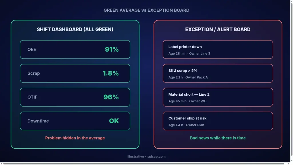
Averages smooth the day. A line that ran at 92% OEE for six hours and 40% for two still prints as “OK” if the shift average clears the target. Scrap at 1.8% against a 2% target looks fine until you notice that one SKU is at 7%. Delivery on time looks healthy until one customer, the one with the contract penalty, is late three times in a row.
Managers do not need another chart of yesterday’s averages. They need a short list of exceptions: what broke the rule, since when, who owns it, and what happens if we do nothing. That is the job of an alerting / exception view — not a prettier version of the same KPI wall. If your KPIs themselves are still argued plant by plant, fix the KPI dictionary first; an alert on a fuzzy definition only creates noise.
What belongs on an exception dashboard
- A clear rule. Each row is a breach of a written threshold (time, quantity, quality, cost), not a feeling.
- Age of the exception. How long has it been open? A two-hour delay and a two-day delay are different problems.
- Named owner. A person, not a department. If nobody owns it, it will wait until Friday.
- Impact if ignored. Hours, units, cash or customer risk — even a rough band is better than nothing.
- Next action and due time. One sentence. Without it, the board becomes a museum of red rows.
- Escalation path. Who sees it after 4 hours? After one shift? After one day?
This is different from a live operations screen that shows every station. A live view is for the people who run the hour; I wrote about that path in from spreadsheet chaos to one live dashboard. An exception dashboard is for the people who decide when the hour is already lost — plant manager, planning lead, quality lead. Keep both; do not merge them into one crowded page.
Worked example: late news vs early exception (illustrative)
The numbers below are an illustrative example, not data from a real plant. They show why timing of the same signal changes the bill.
A packing line ships about 800 cartons a day. When a label printer fails, the line can keep packing for roughly 90 minutes on a small buffer, then it stops. A late label means either overtime or a missed truck.
| How the signal arrives (illustrative) | When management sees it | Typical outcome |
|---|---|---|
| End-of-day scrap / overtime report | Next morning meeting | Overtime already spent; truck already missed or rushed |
| Green OEE tile (shift average still “OK”) | Often never as an exception | Two quiet hours of loss buried in the average |
| Exception: “label printer down > 20 min” with owner | Within ~20–30 minutes | Spare printer or temporary label process before the buffer runs out |
Illustrative cost sketch: overtime for eight people at about 1.5 hours after a late discovery might cost, say, $480 in labour alone (numbers are examples). Catching the same stoppage at 25 minutes might need one technician for 40 minutes and a temporary label workaround — a fraction of that, and the truck still leaves. The plant did not need a smarter average. It needed the bad news early, with a name next to it.
The same logic applies to open production bottlenecks: if you only discover the constraint in the weekly report, you have already paid for it. See finding the open bottleneck with data for the measurement side; the exception board is how you keep it visible between analyses.
Design rules that keep alerts useful
- Start with five exceptions, not fifty. Safety stop, critical machine down, quality hold, material shortage that stops a line, missed customer ship risk. Add more only when these five are trusted.
- Define “open” and “closed”. An exception closes when the condition is gone and a short note says what was done. Otherwise the list never shrinks.
- Separate noise from risk. If an alert fires twenty times a shift and nobody acts, the threshold is wrong or the owner is wrong. Fix it; do not hide it with colours.
- Put the board where decisions happen. Morning huddle screen, planning room, or a short message to the shift lead. A login nobody opens overnight is not an alert.
- Review false alarms weekly for four weeks. Retire or retune anything that did not change a decision. Trust is the real KPI of an alerting system.
A two-week starter path
- Days 1–2: Pick five exception rules with the plant manager and line owners. Write thresholds and owners on one page.
- Days 3–5: Pull the signal from the system you already have (MES event, ERP shortage, quality hold). No new platform yet.
- Days 6–8: Build one simple board: open exceptions, age, owner, impact band, next action. Paper or spreadsheet is fine for the pilot.
- Days 9–10: Run it in the morning meeting. Track which exceptions changed a decision.
- Days 11–14: Kill noisy rules, tighten thresholds, and only then decide whether to automate the feed into a live tool.
If the underlying process is unclear, do not automate chaos. Process clarity and data ownership come first — the same discipline I described for taking AI pilots to the shop floor: without owner, metric and reaction plan, alerts become theatre.
Checklist: is your bad news early enough?
- Every critical risk has a written threshold, not only a monthly KPI.
- Open exceptions show age and a named owner.
- Someone reviews the list every shift or every morning, not only on Friday.
- Closing an exception requires a short “what we did” note.
- False-alarm rate is reviewed; noisy rules are fixed or removed.
- Customer, safety and stoppage risks escalate automatically after an agreed time.
- The live operations view and the exception view are not mixed into one crowded screen.
Still finding out on Friday?
If your morning meetings are calm and your Fridays are expensive, send me a short note. We can map five exception rules for your plant, agree owners and thresholds, and sketch a board you can run within two weeks — or use the free factory data check if you prefer a lighter first step.
Contact me Read: live operations dashboard Read: KPI dictionary
Sources
- Practical framing drawn from shop-floor alerting patterns (threshold, owner, age, escalation). Numbers in the worked example are illustrative only.
- Related reading on this site: live operations dashboards, KPI definitions, bottleneck finding, and pilot-to-production readiness.